Plot Multiple Faceted Scatter with Averages
Source:R/plotting.R
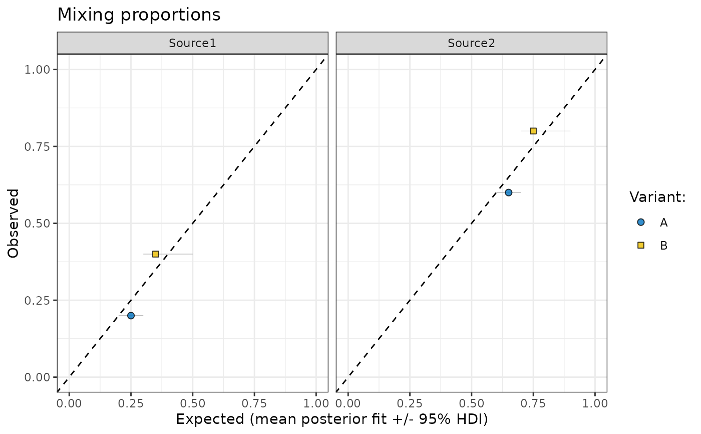
plot_multiple_faceted_scatter_avg.RdThis function creates a faceted scatter plot to compare observed and predicted values, including error bars and visual grouping by variants. It is designed for visualising mixing proportions or similar data with multiple sources. It's mostly used to plot outputs of make_post_prop_long.
plot_multiple_faceted_scatter_avg(data, ...)Arguments
- data
A data frame containing the data to be plotted. It must include the following columns:
- Observed
Numeric. The observed values for each source.
- Predicted
Numeric. The predicted values for each source.
- ymin
Numeric. The lower bound of the error bar for the predicted values.
- ymax
Numeric. The upper bound of the error bar for the predicted values.
- Variant:
Factor or character. The grouping variable for different variants.
- source
Factor or character. The source variable used for faceting.
- ...
Additional arguments passed to the
labsfunction for customizing plot labels.
Value
A ggplot object representing the faceted
Details
The function generates a scatter plot with error bars for predicted values, points representing
observed vs. predicted values, and a diagonal reference line (slope = 1) for visual comparison.
The plot is faceted by the source variable and grouped by the Variant: variable, with
customizable shapes and colors for each variant.
The scale_fill_jco function from the ggsci package is used to apply a color palette,
and the scale_shape_manual function is used to define point shapes.
See also
Examples
library(MixMustR)
data <- data.frame(
  Observed = c(0.2, 0.4, 0.6, 0.8),
  Predicted = c(0.25, 0.35, 0.65, 0.75),
  ymin = c(0.2, 0.3, 0.6, 0.7),
  ymax = c(0.3, 0.5, 0.7, 0.9),
  `Variant:` = c("A", "B", "A", "B"),
  source = c("Source1", "Source1", "Source2", "Source2"),
  check.names = FALSE
)
plot_multiple_faceted_scatter_avg(data)