Plotting eReefs data
Times series plots
Learn how to create time series plots of eReefs data in .
In this tutorial we use time series plots of eReefs data to examine the seasonal trends in northward currents for a single location off the coast of Cooktown, QLD Australia.
Motivating problem
Heat waves occur in the shallow waters of the Great Barrier Reef (GBR) in much the same way that they occur on land. When the waters gets too hot for too long, corals become sick and can eventually die (as a result of coral bleaching). As the Earth continues to warm under a changing climate, these heat waves are becoming hotter, longer, and more frequent, threatening the survival of the GBR as we know it.
Different coral populations along the GBR are adapted to the long-term temperature ranges which may be considered normal for the area in which they live. In general, this means that the northern populations are better able to handle warmer waters than their southern counterparts. Some of these adaptations are encoded in the their genomes and we can imagine that the spread of these warm-adapted genes to the southern GBR would confer some level of resilience to future heat wave events.
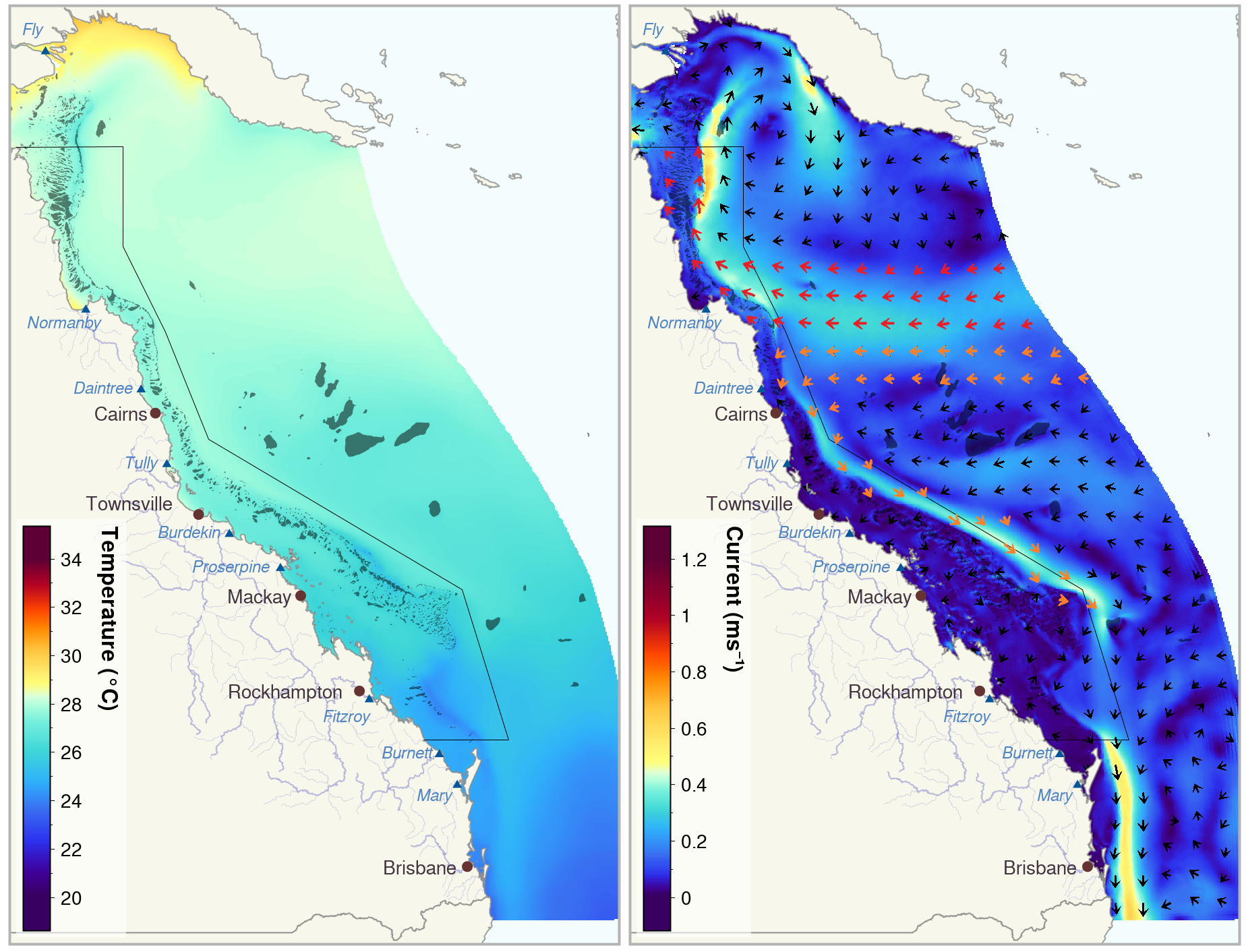
However, major ocean currents along the GBR bifurcate, i.e. split, off the coast of Cairns (Figure 1), creating prevailing northward currents in the waters to the north. It has been suggested that these northward currents may act as a genetic barrier for corals, preventing coral larvae from travelling south and spreading their genes into the Southern GBR.
We wish to examine this phenomena on a finer scale to get a sense of how strong and persistent this genetic barrier may be.
R Packages
library(readr) # faster data importing
library(tidyverse) # a suite of packages including dplyr, tidyr, ggplot2, stringr
library(janitor) # create better variable names
library(leaflet) # making interactive maps
library(lubridate) # easier handling of dates and times
library(plotly) # making interactive plots
library(fontawesome) # to put icons in R markdown html
library(htmltools) # for styling interactive outputs

# Load our custom function to create time series plots with data grouped by year (or a given period <= 12 months). We will go through this function later in the tutorial.
source("ggTS_byYear.R")NOTE: The code for ggTS_byYear.R is provided the Advanced time series plots section below.
The data
Data was extracted from the eReefs GBR Hydrological Model (4km) v4.0 using the online data extraction tool for a single point approximately 60 km south of Lizard Island (shown in Figure 2). For this point we extracted the daily aggregated data for the northward current at a depth of 0.5 m (as coral larvae generally travel in the top of the water column) and the northward windspeed (to see if the wind may be a key driver of current speed and direction). Both of these variables have the units of meters per second (m/s), where a positive value indicates the speed of the current/wind to the north, and a negative value, to the south. We extracted all data between 1 September 2010 - 1 September 2022.
Download the 2303.b87e9d6-collected.csv file to the data folder and rename it to extracted_ereefs_data__time_series_plot.csv.
# Import data with 'clean' variable names and then take a 'glimpse'
ereefs_data <- read_csv("data/extracted_ereefs_data__time_series_plot.csv") |> clean_names() |> glimpse()
Rows: 8,768
Columns: 12
$ aggregated_date_time <dttm> 2010-09-01, 2010-09-01, 2010-09-02, 2010-09-02, …
$ variable <chr> "wspeed_v", "v", "wspeed_v", "v", "wspeed_v", "v"…
$ depth <dbl> 99999.9, -0.5, 99999.9, -0.5, 99999.9, -0.5, 9999…
$ site_name <chr> "extraction point", "extraction point", "extracti…
$ latitude <dbl> -15.25, -15.25, -15.25, -15.25, -15.25, -15.25, -…
$ longitude <dbl> 145.46, 145.46, 145.46, 145.46, 145.46, 145.46, 1…
$ mean <dbl> 6.17655035, 0.11174639, 5.97394102, 0.11343298, 7…
$ median <dbl> 6.26913939, 0.14671343, 6.04144896, 0.11044985, 7…
$ p5 <dbl> 5.346766602, 0.000353042, 5.447607187, 0.07272162…
$ p95 <dbl> 7.231647611, 0.200932400, 6.545938471, 0.20063861…
$ lowest <dbl> 5.2204528552, 0.0000000000, 5.3579356785, 0.06825…
$ highest <dbl> 7.231647611, 0.200932400, 6.545938471, 0.20063861…Here we can see that we have data for the wspeed_v (northward wind velocity) and v (northward current velocity) for our single site site_a with the coordinates (145.46, -15.25). As we have downloaded the daily aggregated data, we get the mean, median, p5 (5th percentile), p95 (95th percentile), lowest and highest values for each day between 1 September 2010 through 31 August 2022.
Above we used the readr package’s read_csv function which is much faster at reading in large datasets compared to R’s base function read.csv. We then applied the janitor package’s clean_names function, which formats the variable names in consistent matter, making it much more convenient for use in R.
Interactive GBR maps
Lets have a closer look at the site for which we have extracted the eReefs data by plotting it on an interactive leaflet map along with the GBR reef features. The GBR reef features layer is located in the eAtlas Web Mapping Service (AIMS). A list of other layers available in this server can be found on the eAtlas GeoServer.
You can find out more about creating leaflet maps in R in this RStudio leaflet tutorial.
# Get unique coordinates from data (in this case only one set of lat/lon)
site_coords <- data.frame(
  lat = unique(ereefs_data$latitude),
  lon = unique(ereefs_data$longitude)
)
# Plot coordinates on a leaflet map
site_map <- site_coords |>
    leaflet( # create a blank leaflet map
      options = leafletOptions(attributionControl=FALSE) # remove the 'leaflet' watermark
    ) |>
    addTiles() |>  # adds a basemap (OpenStreetMap by default)
    addMarkers() |>  # add a marker at the given coordinates
    addScaleBar()

# Add the GBR reef features (WMS layer) to the map
site_map <- site_map |>
    addWMSTiles(
      baseUrl = "https://maps.eatlas.org.au/maps/wms?", # Link to WMS server
      layers = c("ea:GBR_GBRMPA_GBR-features"), # Names of layers (located in the WMS server) to display
      options = WMSTileOptions(format = "image/png", transparent = TRUE)
    )

# Display the map centred at our site
site_map |>
setView(lng = site_coords$lon[1], lat = site_coords$lat[1], zoom = 9)Basic time series plots
Since we are interested in gaining some insight into the possibility of northern coral larvae migrating southward through our site, we should have a look at the north-south current velocity data.
ereefs_data |>
  dplyr::filter(variable == "v") |>  # select the current variable
  ggplot(aes(x = aggregated_date_time, y = mean)) + # and plot the daily mean
  geom_line(alpha=0.7) + # specify a line graph of the mean
  geom_abline(slope = 0, intercept = 0, color = "red", linewidth = 1) + # add a line a y=0
  scale_x_datetime(date_breaks = "1 year", date_labels = "%Y") + # show only years on x-axis
  theme_bw(base_size=13) +
  labs(x = "Year", y = "Northward current velocity (m/s)")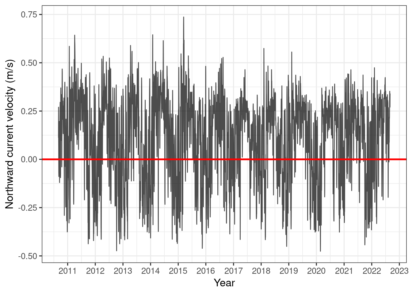
Here we see that there does appear to be a cyclical pattern to the northward current at our site, with southward currents (i.e. negative northward current) primarily in the wet season. This is great news, as this is when coral spawning occurs!
However, in order to get a better idea of what is happening, we should have a closer look at the data for the coral spawning period of roughly October - January.
Advanced time series plots
We wish to produce the plot below, looking at all our data in an approximate coral spawning season of October through January, for each of the years in our data.
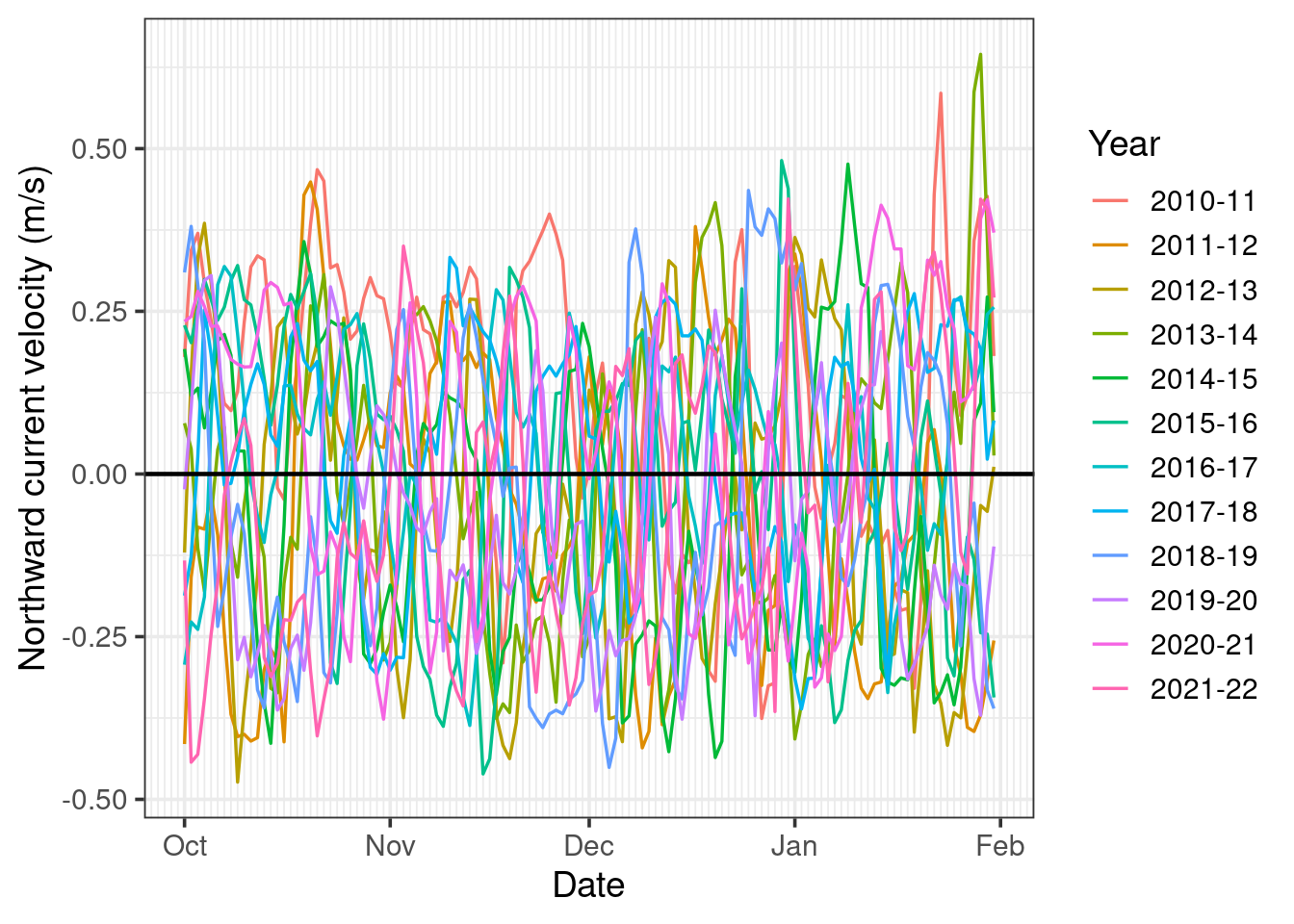
The first thing we can note from this plot is it’s very cluttered, making it difficult to detect any clear trend in our data. However, before we investigate this further, lets look at how the plot was made.
Unfortunately, there does not seem to be any out-of-the-box or intuitive ways to plot a given season (i.e. period less than 12 months) for multiple years in ggplot. However, we can hack a solution by writing a function called ggTS_byYear which creates a fake date variable where all the data is converted to be in the same year and then plots this fake date along the x-axis and groups the data based on the real date. This function is defined below.
You can copy and paste this function into your script if you would like start using it straight away. However, it is also heavily commented should you wish to customise issues, or just simply see how it works.
When defining large functions such as this it is useful to save the function in a separate script and then import the script into R, e.g. source('ggTS_byYear.R').
########################################################################
## PLOT TIME SERIES BY YEAR OVER A GIVEN PERIOD <= 12 MONTHS          ##
## ------------------------------------------------------------------ ##
## RETURNS: ggplot object (without geoms)                             ##
## REQUIRES: ggplot, dplyr, magritter, lubridate                      ##
## ------------------------------------------------------------------ ##
## Example:                                                           ##
##    salinity_time_series_plot <-                                    ##
##      ggTS_byYear(                                                  ##
##        data = eReefs_data,                                         ##
##        date_col_name = date_time,                                  ##
##        response_col_name = daily_mean_salinity,                    ##
##        start_month = 6,                                            ##
##        end_month = 5                                               ##
##      ) +                                                           ##
##      geom_line() +                                                 ##
##      labs(y = "Daily mean salinity", x = "Date", colour = "Year")  ##
##                                                                    ##
## Warning: not designed for plot periods > 12 months                 ##
##                                                                    ##
## Function concept: fake year(s) is used to put data for all years   ##
##                   on same x-axis, whereas plot period denotes      ##
##                   real year(s)pertaining to the data dates         ##
##                                                                    ##
## Note: x-axis major breaks are months, if a different period is     ##
##       required, use the ggplot2::scale_x_datetime() function       ##
########################################################################
ggTS_byYear <- function(
    data, # dataframe with POSIX dates and continuous response
    date_col_name, # the name of the dataframe column with the date variable to plot
    response_col_name, # the name of the dataframe column with the response variable to plot
    start_month = 1, # lower time series limit (default January)
    end_month = 12, # upper time series limit (default December)
    minor_breaks_period = "1 day" # the period for the graph's x-axis minor breaks (e.g. 1 week, 1 day)
) {
  # SETUP
  require(ggplot2)  # for plotting
  require(magrittr) # source of the pipe  |> ) function
  require(dplyr)    # data manipulation
  require(lubridate) # date handling
  fake_year <- 0001 # fake year used to have all dates over same period (grouped by real year)

  # APPEND VARIABLES TO DATA FOR USE IN PLOTTING
  data = data |>
    mutate(
      datetime = as_datetime({{date_col_name}}), # Ensure dates in POSIX format
      year = year(datetime), # Create columns for real year and
      month = month(datetime) # real month
    )

  # THE CASE WHEN THE PLOT PERIOD IS WITHIN A SINGLE CALENDER YEAR (e.g. June 2016 - Nov 2016)
  if (start_month <= end_month) {
    # Get x-axis breaks and labels:
    plot_months = c(start_month:(end_month+1)) # vector of months to plot (including end_month)
    plot_breaks = make_datetime(fake_year, plot_months) # x-axis major breaks at each month
    # Assign data to plot periods and fake years and filter out data not needed:
    data <- data |>
      mutate(
        # Plot period is within the real year (e.g. June 2016 - October 2016)
        plot_period_label = paste(year), # data for all months pertain to respective year
        dummy_date = update(datetime, year = fake_year) # all data plotted over fake year (e.g. 0001)
      ) |>
      filter(month >= start_month & month <= end_month)
  }

  # THE CASE WHEN THE PLOT PERIOD IS SPREAD ACROSS TWO CALENDER YEARS (e.g. Nov 2016 - June 2017)
  if (start_month > end_month) {
    # Get x-axis breaks and labels
    plot_months_y1 = c(start_month:12) # a vector of months to plot in the former year
    plot_months_y2 = c(1:(end_month+1)) # a vector of months to plot in the latter year
    plot_months = c(plot_months_y1, plot_months_y2)
    plot_breaks <- c(
      make_datetime(fake_year, plot_months_y1),
      make_datetime(fake_year+1, plot_months_y2)
    )
    # Assign data to plot periods (i.e. based on real dates), create the fake date
    # (using fake_year and fake_year +1), and filter out data not needed:
    data <- data |>
      mutate(
        # Plot period crosses two calender years, therefore
        # data for months prior to start_month pertain to preceding plot period
        plot_period_start = ifelse(month >= start_month, year, year-1),
        plot_period_end = plot_period_start+1,
        plot_period_label = paste(plot_period_start, substr(plot_period_end, 3, 4), sep = '-'),
        # Dummy dates: months after start_month plotted in fake year (e.g. 0001), months prior plotted in 0002
        dummy_year = ifelse(month >= start_month, fake_year, fake_year + 1),
        dummy_date = update(datetime, year = dummy_year)
      ) |>
      filter(month >= start_month | month <= end_month)
  }

  # CREATE X-AXIS (DATES) BREAK LABELS
  # If end_month is 12 (December), plot_months ends at 13 (January of next year)
  plot_months <- replace(plot_months, plot_months==13, 1) # Change 13 to 1
  break_labels <- month.abb[plot_months]

  # CREATE PLOT
  ts_plot <- data |>
    ggplot(aes(x = dummy_date, y = {{response_col_name}}, group = plot_period_label, colour = plot_period_label)) +
    labs(x = "Date", y = "Response",  colour = "Year") +
    theme_bw() +
    scale_x_datetime(breaks = plot_breaks, labels = break_labels, date_minor_breaks = minor_breaks_period)

  return(ts_plot)
}
Now we have our function definition, lets see it in action. Recall that our previous plot was quite cluttered, which made it difficult to discern any trends in the data. So this time, let’s plot for just the month of October.
ereefs_data |>
  filter(variable == "v") |>
  ggTS_byYear(aggregated_date_time, mean, start_month = 10, end_month = 10) +
  geom_line(linewidth = 0.7) +
  geom_abline(slope = 0, intercept = 0, linewidth = 0.8) +
  labs(y = "Northward current velocity (m/s)")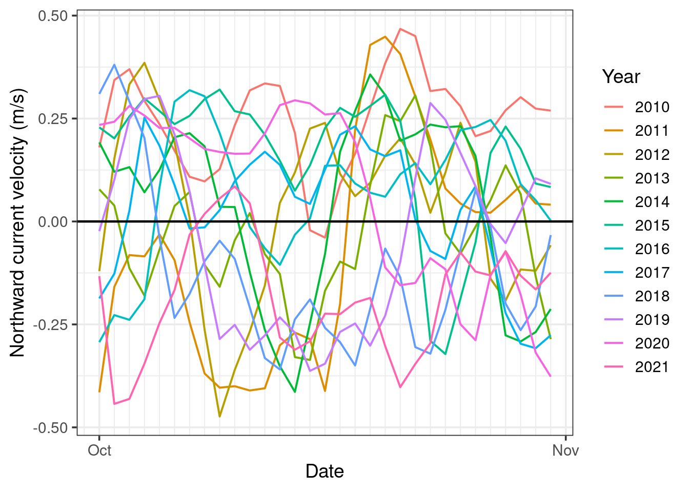
This is significantly easier to digest. However, there is still a lot going on, and sometimes we may wish to see more than a single month at a time.
Interactive time series plots
We can create interactive plots with the plotly package, enabling us to view individual years, compare subsets of the years, and zoom in on our data and pan across. As this interactivity is a virtue of the html file format, plotly plots have limited application (e.g. cannot be used for reports). However, they do allow us to explore our data very easily and intuitively.
Let’s plot our data across an entire year and use the zoom and pan features to explore in more detail. We will plot the graph from September through August, as this aligns with the dates for the data we have extracted.
We will initially show only the years 2015-16 and 2021-22, as this provides a nice instance of high variability in the northward current in different years.
# Create a ggplot and turn it into a plotly plot
plotSepSep <- ereefs_data |>
  filter(variable == "v") |>
  ggTS_byYear(aggregated_date_time, mean, start_month=9, end_month=8) +
  geom_line(linewidth = 0.7) +
  geom_abline(slope = 0, intercept = 0, linewidth = 0.5) +
  labs(y = "Northward current velocity (m/s)") +
  theme(legend.position="top")

plotSepSep |>
  ggplotly(tooltip = "none") |>  # don't show any information on hover (alternative: "mean" would show mean current)
style(visible = "legendonly", traces = c(1:5, 7:11)) # don't show years 2010-2014 & 2016-2020 initiallyThis plot allows us to see what is happening both in individual years and across all the years.
Looking at all years we the trend of current predominantly to the north (positive value) and less variable in (roughly) April through July with southward currents becoming more frequent and strong in August and peaking in (roughly) September through March.
Zooming in to our approximate coral spawning season of October through January, we can see that there are often periods of predominant southward currents, however when these periods occur is highly variable between years.
Exploring wind & current
Since we are interested in the surface current (i.e. we have data for northward current at 0.5 m depth), it seems reasonable to suspect that the wind may be a key driving force behind the current direction and velocity. Let’s examine this suspicion with by looking at the relationship between the mean northward wind and current speeds.
# Create a wide format dataset (separate columns for mean current and wind)
meanWindCurr <- ereefs_data |>
  select(aggregated_date_time, variable, mean) |>  # remove unneeded variables
  pivot_wider(names_from = variable, values_from = mean) |>
  mutate(year = aggregated_date_time |>  year())

# Compute Pearson's correlation coefficient for the northward daily mean current and windspeed
r = cor.test(meanWindCurr$wspeed_v, meanWindCurr$v, method = "pearson")

# Dual timeseries plot of windspeed and current
labs <- c("Northward current velocity (m/s)", "Northward wind speed (m/s)")
names(labs) <- c("v", "wspeed_v")
ereefs_data |>
  ggplot(aes(x = aggregated_date_time, y = mean)) + # and plot the daily mean
  geom_line(alpha=0.7) + # specify a line graph of the mean
  geom_hline(yintercept = 0, color = "red", linewidth = 0.5) + # add a line a y=0
  geom_vline(xintercept = 2011:2022, color = "red") +
  scale_x_datetime(date_breaks = "1 year", date_labels = "%Y")+ # show only years on x-axis
  theme_bw(base_size = 14) +
  theme(panel.grid.major.x = element_line(color = "black", linewidth = 0.5, linetype = "dotted"),
        panel.grid.minor.x = element_line(color = "grey", linewidth = 0.5, linetype = "dotted"),
        panel.grid.major.y = element_blank(), panel.grid.minor.y = element_blank()) +
  labs(x = "Year", y = "Daily mean") +
  facet_wrap(~variable, nrow = 2, scales= "free_y", labeller = labeller(variable = labs))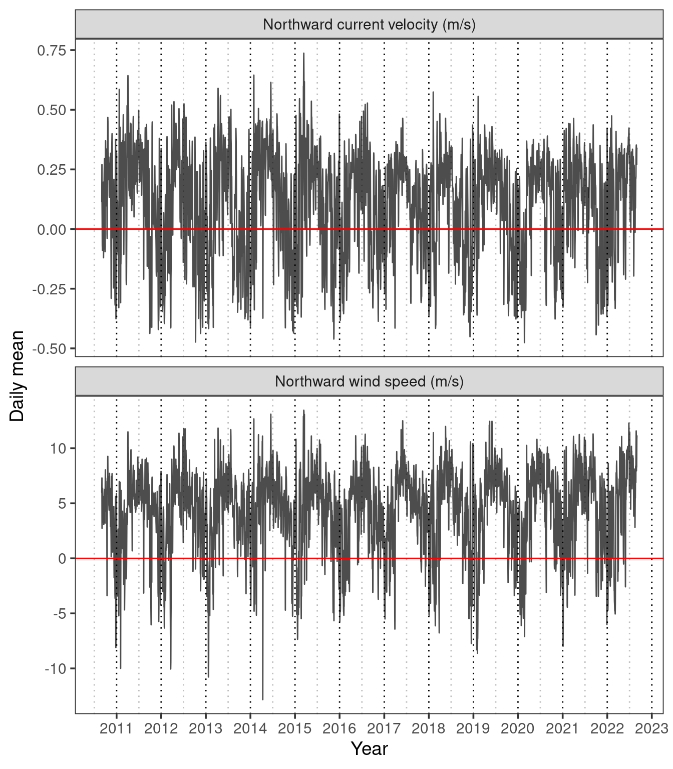
In Figure 7 we can see that there appears to be a reasonably close relationship between the daily mean northward wind speed and current velocity. This is supported by a Pearson’s correlation coefficient of \(r=\) 0.79. We can better visualise this relationship on the scatterplot in Figure 8.
From this data alone we cannot conclude that wind is a driver of current, as it may just be a confounding variable. However, we have at least found a reasonably strong positive relationship between northward windspeed and current.
# Scatter plot of daily mean wind and current
meanWindCurr |>
  ggplot(aes(x = wspeed_v, y = v)) +
  geom_point(alpha = 0.2, size = 2) +
  geom_hline(yintercept = 0, colour = "grey") +
  geom_vline(xintercept = 0, colour = "grey") +
  theme_bw(base_size=14) +
  labs(x = "Northward wind speed (m/s)", y = "Northward current velocity (m/s)")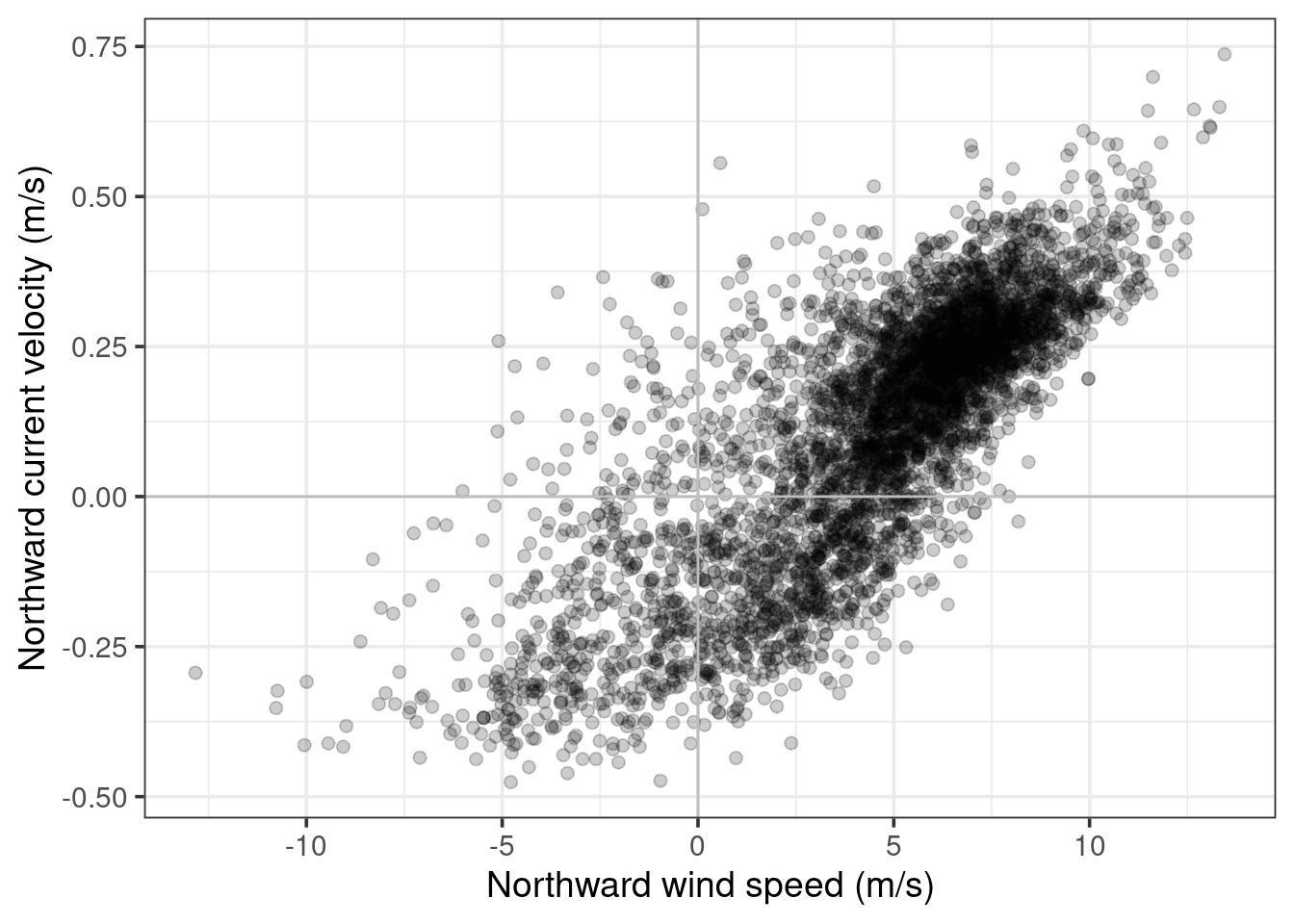
Conclusions & limitations
While it would be nice to draw some conclusions from our analyses about the possibility of northern coral larvae migrating into the southern GBR, the reality is that we can’t. Coral larvae travel on complex paths and predicting these paths is an active and highly sophisticated area of research (find out more in the AIMS connectivity webpage; see a real approach to answering this question in this reef resilience article). Unfortunately, this question is just too complicated for any real insights to be gained from data for only a single site. But, at the very least, we did make some nice graphs!
We also saw that there are indeed periods of southward currents at our site, and these southward currents are most prevalent between the months of (roughly) October through February, and are particularly uncommon between April through June. We have shown that there is a positive relationship between the northward windspeed and northward current for our site.